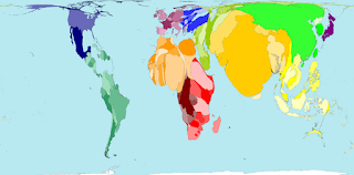
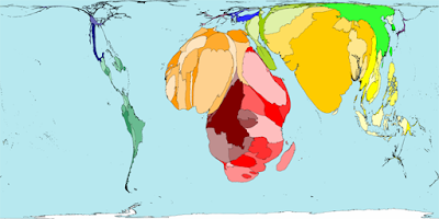
 According to an article in the Bulletin of the World Health Organization, seeing the world shaped by how many babies are born in a year is a more reliable and rapid way of communicating these numbers, than through tables or maps with different colors.
 That is exactly what Worldmapper does. It creates a map where the sizes of countries represent the proportion of all children worldwide who were born there. A country that is quite small but with many births increases in size, while a territory with a large area but few births shrinks. Each birth is allocated the same amount of space, and thus country borders are stretched and crumpled around these adjusted areas.
Worldmapper's software has produced already 366 similar maps reshaping the world according to different indicators. What attracts me to these (apart from my fascination with maps) is that they inherently refer to social justice. The mere fact that inequality "distorts" the usual shape of countries makes you aware that something is wrong. Indeed, what else can we say about a world where the probability of a child to die before its fifth birthday varies between 5 and more than 300?


No comments:
Post a Comment